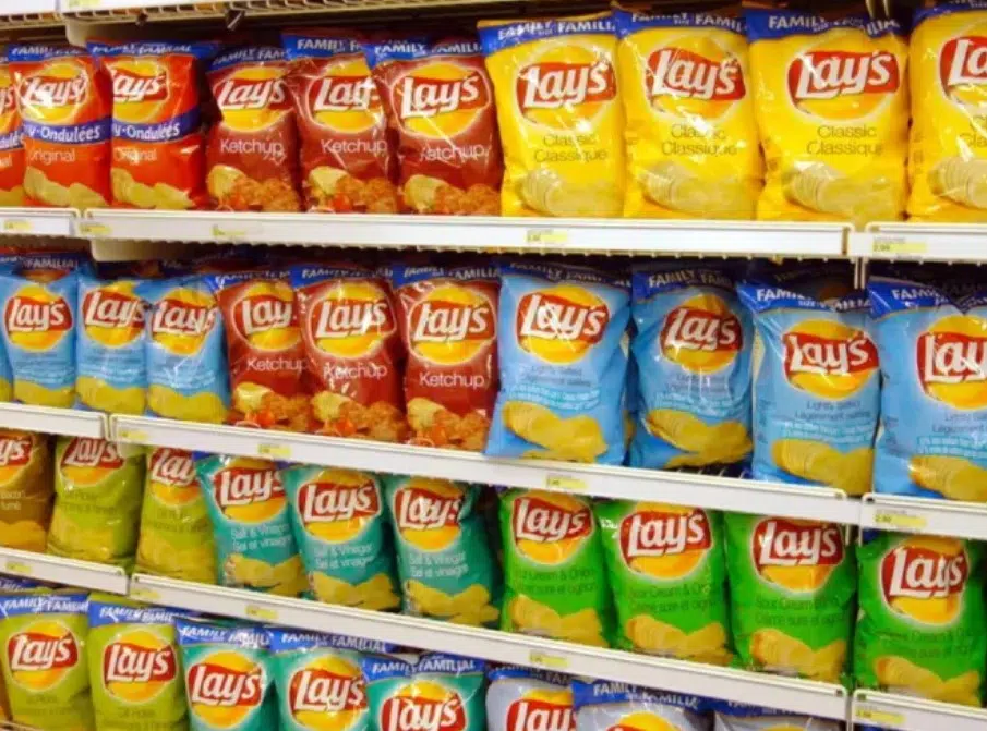
Most people have seen the Lay’s logo countless times without giving it much thought. It is familiar, bright, and instantly recognizable on store shelves. With its yellow background, red banner, and bold white lettering, it has become one of the most well-known snack logos in the world. But according to many branding enthusiasts, there is a subtle design detail in the logo that often goes unnoticed.
At first glance, the Lay’s logo may seem simple. However, its design appears to reflect more than just a cheerful image for a potato chip brand. Many people believe it also contains a visual connection to its parent company, Frito-Lay.
A Brand With a Long History
Lay’s has been around since 1932 and was named after its founder, Herman Lay. Over the decades, the brand grew into one of the most recognizable names in the snack industry. Today, Lay’s is part of the larger Frito-Lay family, which includes several major snack brands enjoyed around the world.
Because of this connection, some people have noticed similarities between the Lay’s logo and the broader Frito-Lay branding.
The Detail Hidden in Plain Sight
The part that catches attention is the yellow circular shape behind the Lay’s name. While it may look like a simple background element, many believe it closely resembles the sun-like shape used in the Frito-Lay logo.
Frito-Lay’s branding has long featured a golden orb or sun-inspired shape paired with a red banner. Lay’s uses a similar visual structure, though in a cleaner and more simplified way. This creates a subtle sense of continuity between the individual brand and the larger company behind it.
Rather than being a secret symbol, this detail works more like a quiet design link. It helps keep the brand visually connected to the Frito-Lay identity without making the relationship too obvious on the packaging.
Why the Sun-Like Shape Matters
Design choices in branding are rarely accidental. The yellow circular shape can suggest warmth, freshness, and energy. These are all qualities that snack brands often want to communicate to consumers.
The golden color may also bring to mind the look of crispy potato chips, helping reinforce the product visually without using words. It is a simple but effective way to shape how people feel about the brand.
The Power of Red and Yellow
The colors in the Lay’s logo also play an important role. Yellow is often associated with positivity, warmth, and appetite, while red is known for attracting attention and creating a sense of excitement.
Together, these colors are commonly used in food marketing because they are visually strong and memorable. In the case of Lay’s, they help make the packaging feel lively, inviting, and easy to spot.
More Than Just a Logo
What makes this design detail interesting is how subtle it is. Most people do not stop to study a bag of chips before opening it, yet the branding still works on a visual level. The shape, colors, and layout all help reinforce the identity of the product and its connection to a much larger snack brand family.
The next time you see a bag of Lay’s, take a closer look at the logo. You may notice that it is more than just a simple design. It is a carefully crafted image that carries a quiet nod to the brand’s history and its place within the Frito-Lay family.
Final Thoughts
The hidden detail in the Lay’s logo is not a dramatic secret, but it is an interesting example of smart branding. The yellow circle behind the name appears to echo the design style of Frito-Lay, helping create a visual connection that many people overlook.
It is a reminder that even the most familiar logos often contain thoughtful choices that shape how we recognize and remember a brand.